Located on the tree-lined streets of a former Golf Links Estate, Jonathon and Alicia’s home sits in a historical enclave described by the National Trust as an “outstanding portrayal of the middle-class suburban ideal”. Built in Melbourne’s Camberwell in the late 1920s and ’30s, one century later the area still embodies similar virtues.
“It’s a really lovely leafy, green suburb,” says interior designer Martine Cooper. “It’s a very family friendly area with a lot of grand historical residences, great schools and a strong community.” Jonathon and Alicia, who live here with their two young children, have a longstanding connection to the area and wanted to preserve their home’s original features, blending them seamlessly with a contemporary extension.
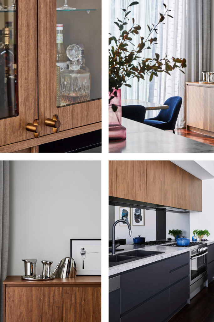
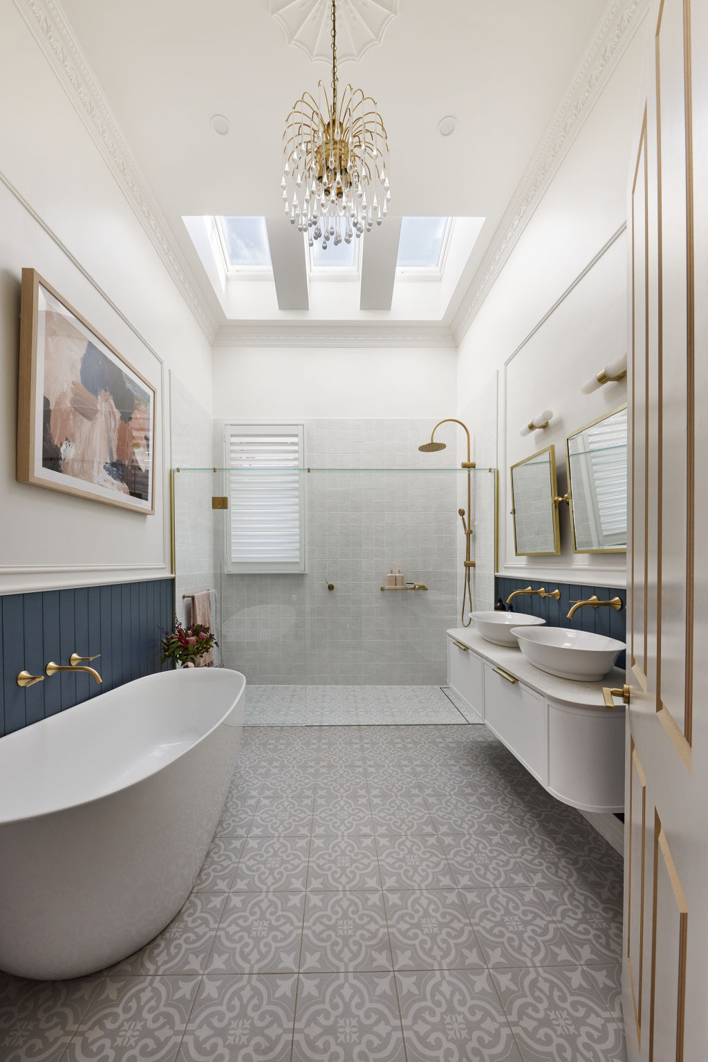
Martine started by taking an inventory of the period features that gave the home its distinctive character. “Knowing they loved the Art Deco style was our starting point,” she says. “I took note of features like the fan-shaped door handles in tarnished brass, the terrazzo floors in the bathrooms and portico, and the pink-toned lead light windows.”
Using these details as inspiration, Martine chose shapes, colours and materials for the extension that are in sympathy with Art Deco style. “Trying to match decorative items, like cornicing and ceiling roses, can feel a little contrived,” she says. “However, we did repurpose original items if they made sense.” This sensitive approach has resulted in a beautiful balance and a contemporary home that offers an authentic nod to Art Deco architecture and interiors.
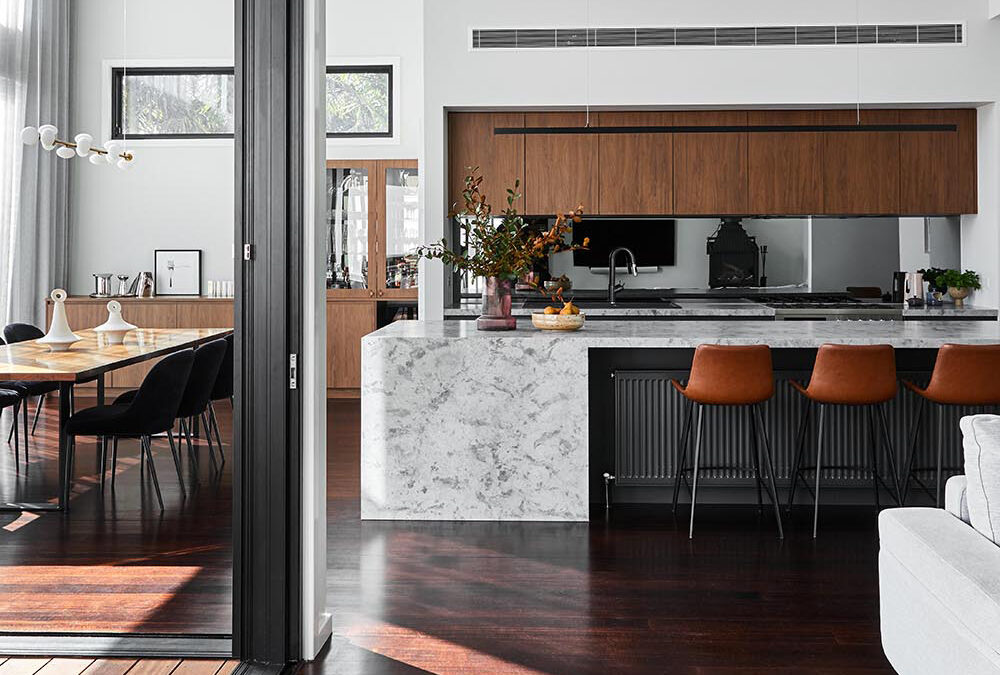
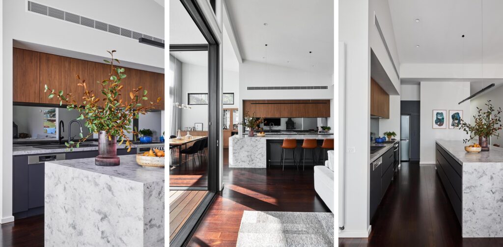
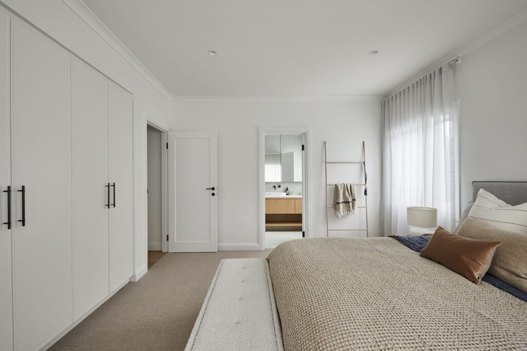
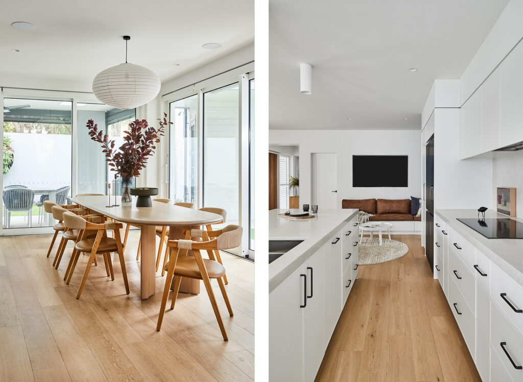
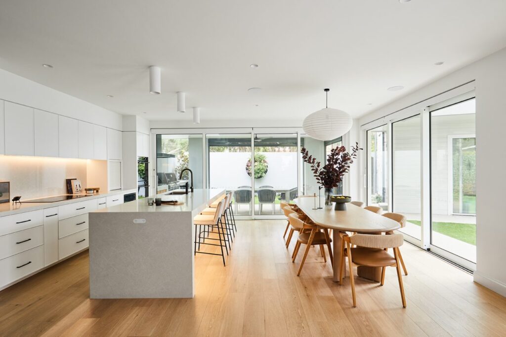
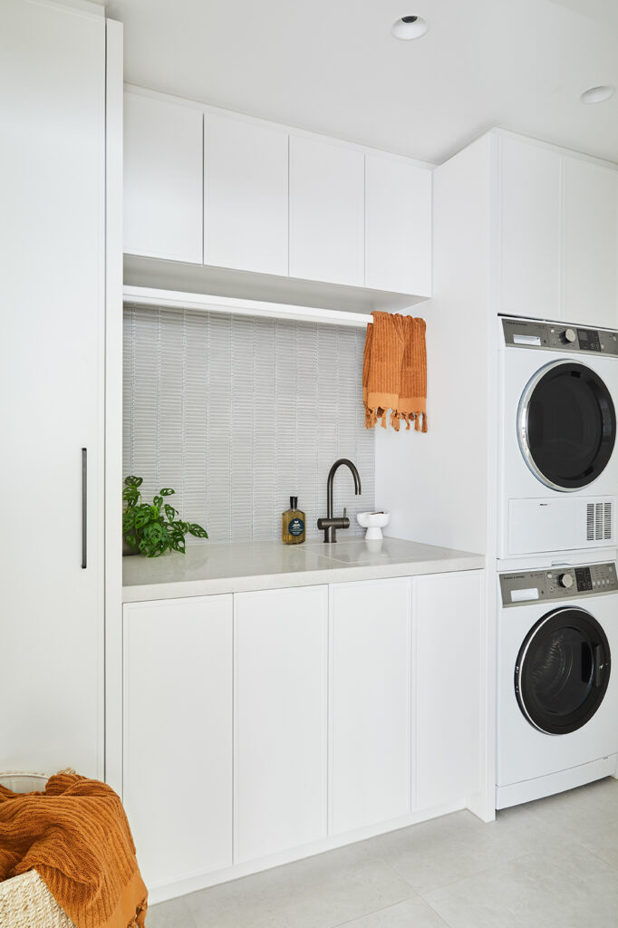
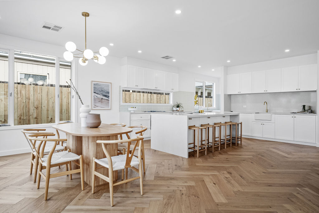
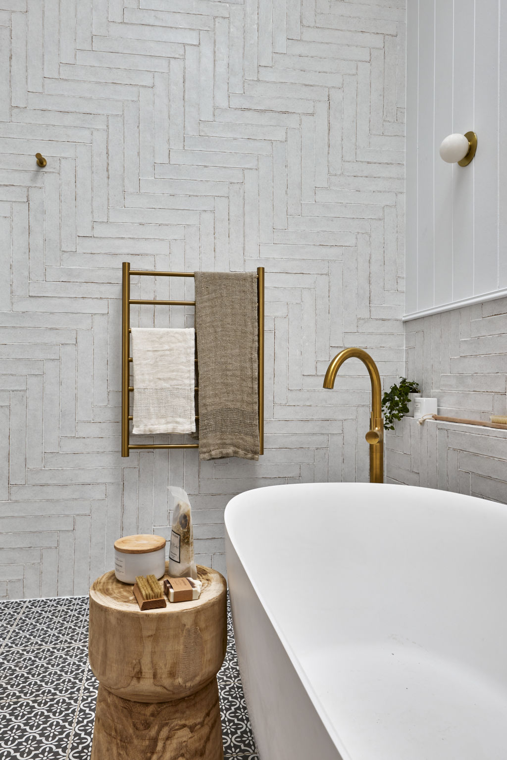
KitchenA marriage of old and new, Jonathon and Alicia’s kitchen (Left & middle) features Polytec ‘Woodmatt’ in Florentine Walnut on the upper cabinetry, with Polytec ‘Ultramatt’ in Lava below. The original floors were restained in a walnut hue. Kitchen/dining The vast open-plan area (middle) inhabits the modern extension. “It’s worth thinking about how an extension might change your access to light,” says Martine of the sunny space.
“EACH SPACE FLOWS SEAMLESSLY INTO THE NEXT, CREATING A HARMONIOUS BLEND OF CLASSIC AND CONTEMPORARY STYLES”
MARTINE COOPER, INTERIOR DESIGNER
Step outside your comfort zone
“Don’t be afraid to mix things up,” suggests Martine, “particularly in an Art Deco home where tapware, cabinetry and door handles are like the jewellery that brings an outfit together.” Choosing a mix of polished brass, gunmetal and chrome finishes can impart a modern look that takes its cues from the sleek symmetry of the 1920s and ’30s. “I would avoid following the latest trends,” she warns. “Instead, lean into the period features of your home and be a little more adventurous in your material and colour selections.” Taking this sensitive approach will leave your interior with a harmonious look that transcends eras and trends.
Designer’s tip
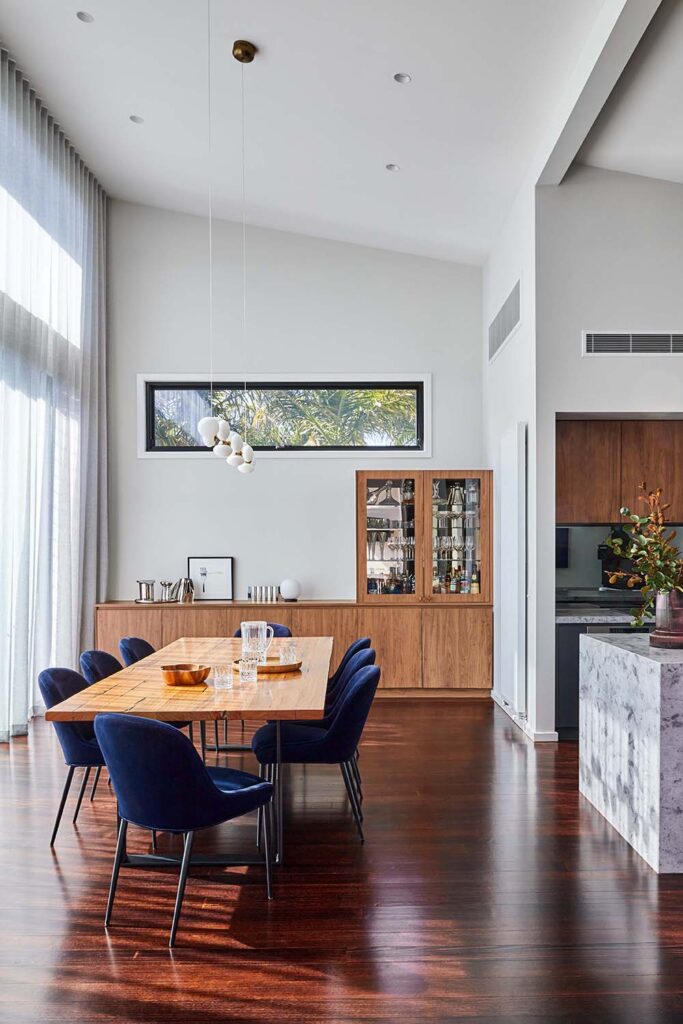
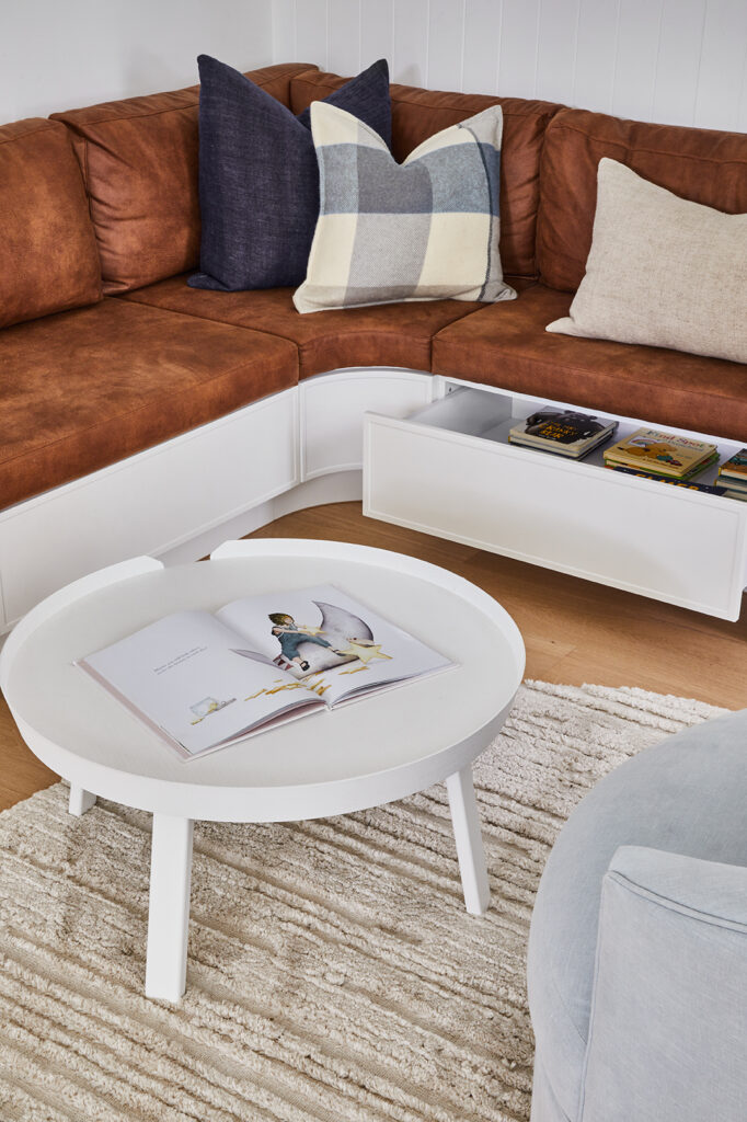
Before you start a heritage renovation, take a moment to consider your current and future storage needs. “Old homes tend to be a little short on storage,” says Martine, “so look for opportunities to incorporate clever solutions.” In the dining area (above), she included both open and closed storage, with the run of cupboards opposite the kitchen also serving as a display ledge.
Drinks cabinet Lo & Co ‘Intersect’ knobs in Bronze (top left) emulate Art Deco elegance on the drinks cabinet. Dining In the dining space (top right), light filters through sheer curtains from In Vogue Blinds. Adding glamour is a Georg Jensen ice bucket, ‘Alfredo’ salt and pepper grinders and ‘Indulgence’ champagne cooler (bottom right), near a ‘Spaghetti’ print by Mariya Rovenko from Forman Art & Framing. Kitchen Contemporary appliances offer “easy living” in the kitchen (bottom left).
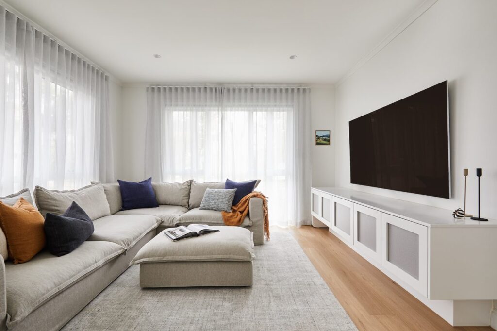
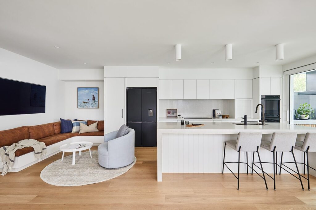
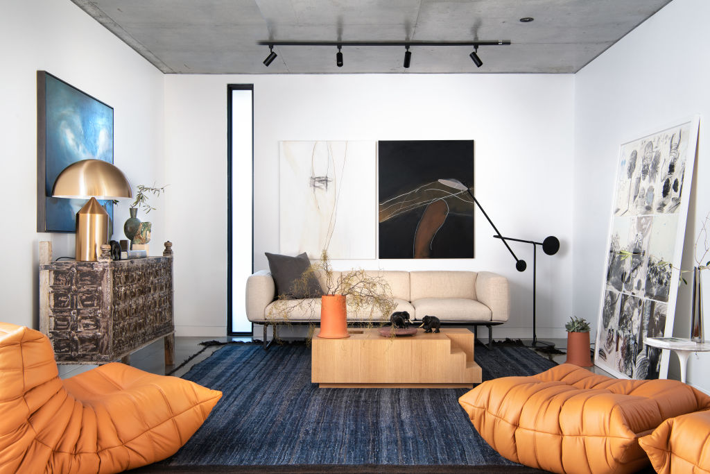
Living A custom ‘Milan’ swivel chair from Arthur G juxtaposes a Cadrys Persian-style rug in the formal living zone .
“WE INCLUDED SUBTLE NODS TO ART DECO THROUGHOUT THE HOME, WITHOUT BEING TOO LITERAL”
MARTINE, INTERIOR DESIGNER
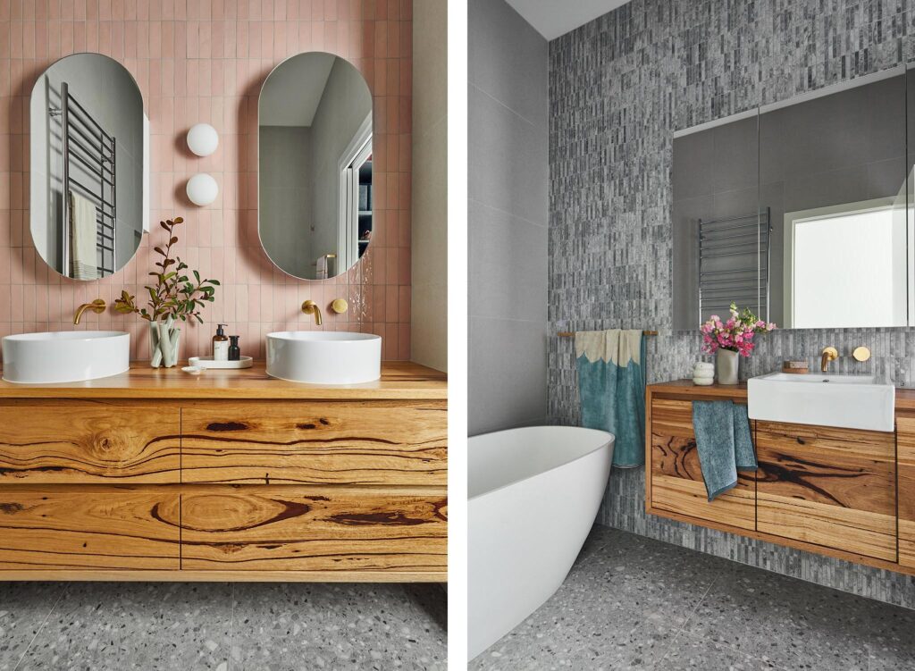
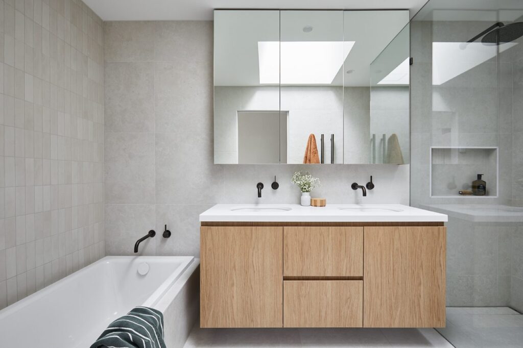
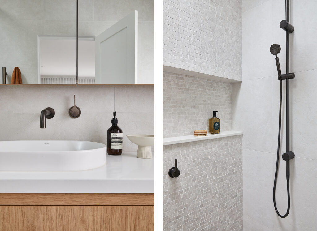
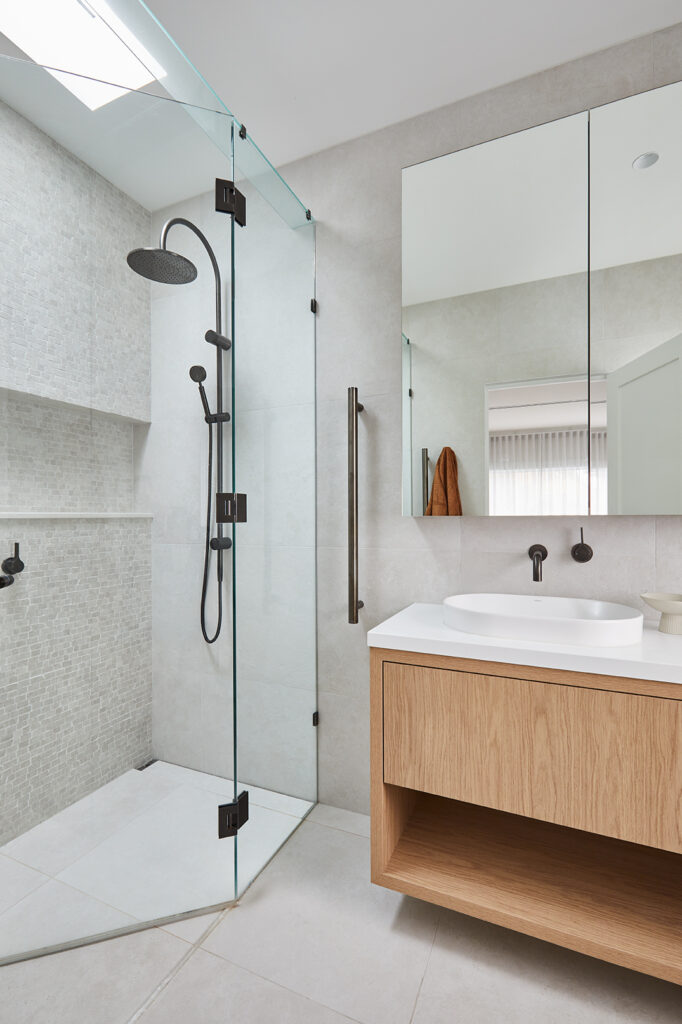
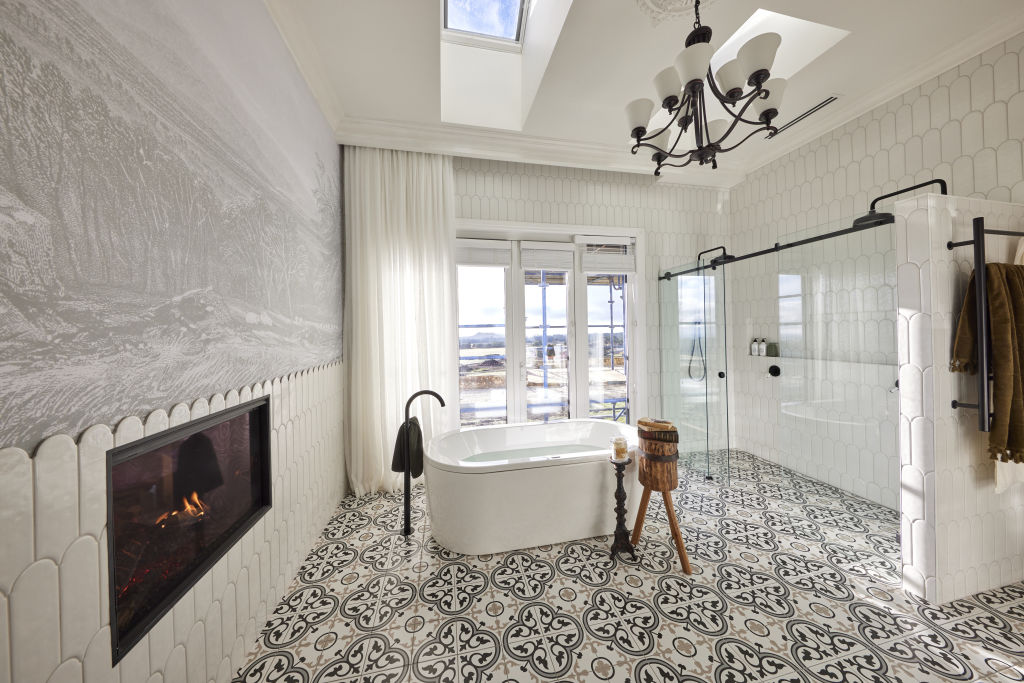
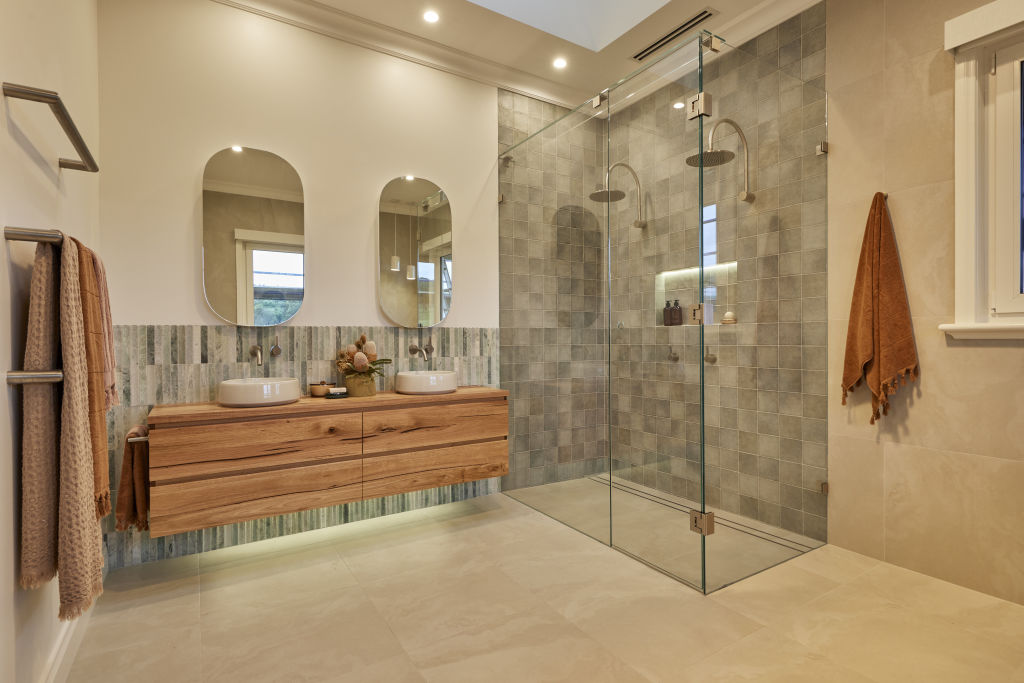
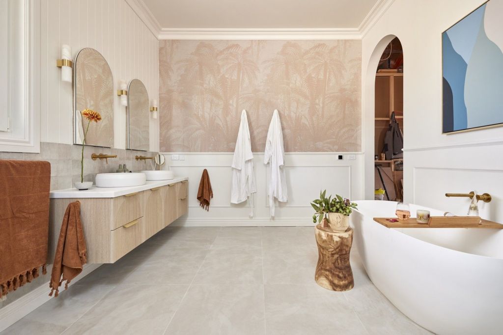
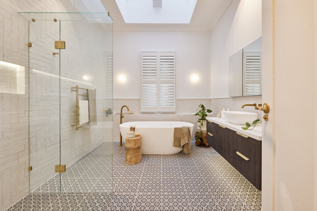
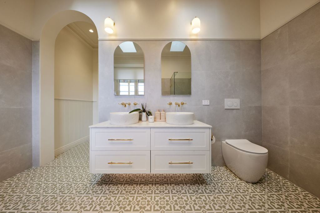
Ensuite Perini ‘Blends’ ceramic tiles in Blush make a bold statement in the ensuite (Left), as do the mirrored Otti Australia ‘Noosa’ shaving cabinets and custom recycled messmate vanity by CH Furniture. Bathroom Grey abounds in the bathroom (middle & right), with finger tiles in Super White and ‘Wynston’ terrazzo-look porcelain tiles in Grigio, both from Perini.
Avoid imitation
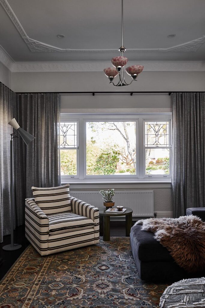
“Don’t try to reproduce the original,” says Martine. “Instead, create subtle connections between old and new.” In this home, the existing flooring was in excellent condition, so the builder sourced a similar hardwood for the extension and Martine chose a finish that would visually unite the two sections. “We worked on a rich matte stain to create a beautiful grounding element throughout the whole home,” she says. “I also chose a mix of old and new feature lighting to create some more subtle connections.” An original ceiling light in the formal living room is accompanied by modern fittings in sympathetic shapes, including ‘Orb’ mirror sconces by Lighting Republic from Light Co in the ensuite, and a custom ‘Caterpillar’ light from About Space Lighting in the dining room.
Source book
Design:Martine Cooper Interior Design, mcid.com.au
We’ve become accustomed thinking we need to move out and move on if our ageing house no longer suits our family dynamic. But with the cost of real estate (not to mention the cost and hassle of house-hunting and moving), redesigning and investing in what we have can give us a whole new home. And that’s what this Melbourne family recently did, with the help of interior designer Martine Cooper.
The 22-year-old, award-winning Mirvac home in Port Melbourne was ready for a refresh and the owners engaged Albert Park-based Martine, of MCID, to reinvent the property. Whilst the home was generous in its footprint, which included a separate studio and double garage, it required a rethink for their young family as they continue to grow and evolve.
“We focused on creating a multifunctional open-plan space for cooking, entertaining, and playtime within view of the parents,” Martine explained.
The bathrooms were dated and the kitchen configuration was becoming increasingly impractical for the family of five. General wear and tear both inside and out, motivated a full renovation with the architecturally designed additions of a bedroom and study.
“The design challenge was to develop a solution for the kitchen, dining and casual living spaces to better accommodate three energetic young boys and a puppy!” Martine says. “We introduced elements of luxe whilst remaining practical and maximising storage wherever possible. The custom banquette seating off the kitchen is a standout moment, upholstered in a user-friendly Warwick wipe-down leather-look fabric.”
The owners were drawn to a natural, organic palette and materials, inspired by the textures of South Africa. Small mosaic tiles in the bathroom reflect this inspiration. The location also directed the aesthetic with coastal tones, light timbers, crisp white cabinetry and natural textiles. The softer palette was punctuated with modern, brushed gunmetal tapware and details throughout.
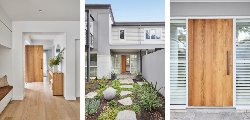
“A feature on arrival is the oversized solid oak front door, welcoming you into the light filled entry. Flooring by Made by Storey complete with hydronic heating provides connection and continuity as you move from room to room.”
MCID collaborated with TLC Interiors on the furniture and decor specifications. A brief of ‘subtle yet elevated’ directed the design decisions for a busy household.
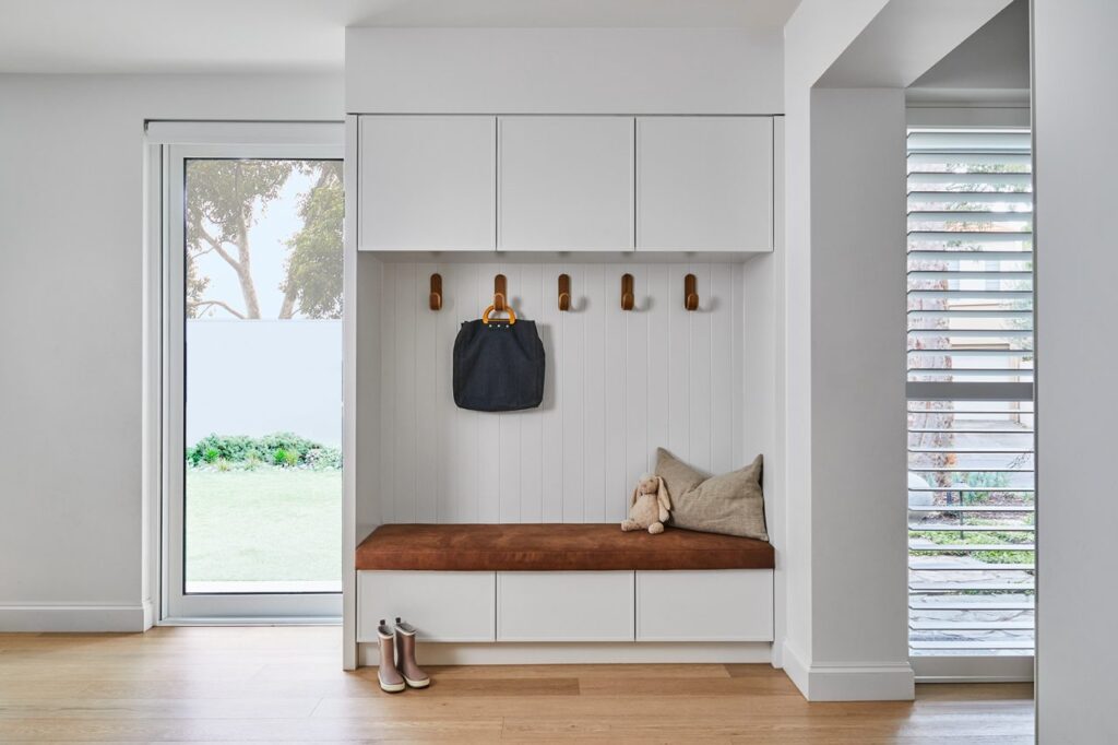
“The mudroom is an example of the attention to detail, merging a high-end finish with the realities of an active household. Close consultation with the family was a priority throughout in making the best decisions, uniquely for them,” Martine said.
“They wanted a ‘turn key’ approach to the end result, right down to the artwork, lighting and window treatments. Natural fibres and linens supported the aesthetic and generated a level of warmth and comfort.
“We wanted to improve flow, creating design solutions to improve their day-to-day life, for the way they want to live.”
A great kitchen is more than just expensive finishes and coveted hardware. It’s packed with smart storage, stylish touches and a well-considered layout.
Whether designing a kitchen or giving it a reboot, you don’t need to break the bank for a five-star space. Designer Martine Cooper says no matter what your budget is, functionality should come first.
“Consider how you live, your workflow and who uses the space,” she says. “It should suit how you live, cook and clean.”
Want a relaxing modern kitchen that is good-looking and functional? Read on for hot trends and budget-friendly tips for creating a dream space with true staying power.
Include storage galore
The Block’s storage queen, judge Shaynna Blaze, was in awe of Kyle and Leslie’s organised kitchen. “Storage galore and drawers for days,” she marvelled. She was equally impressed with Kristy and Brett’s tandem pantry unit and James Bond-style rise-and-fall splashback concealing secret storage space.
Luckily, there are more inexpensive ways to incorporate storage, from drawer dividers and pretty canisters to shelf risers that allow you to stack to the height of the shelf.
Block contestants Kyle and Leslie were praised for the storage in their kitchen. Photo: Nine
“Keeping pantry shelves shallow brings everything to the front and keeps items stacked two to three deep so they don’t disappear,” says designer Angie Rogers. “Ensure there are plenty of drawers that separate goods into sections so you can pull out the whole drawer and look down onto its contents.”
Designer Sarah Elshaug suggests installing a system into tricky corner units to ensure all space is utilised. “The Le Mans system is the best solution, and store-bought lazy Susans are great for smaller corner cupboards,” she says.
Make good use of all available “vertical real estate”, Cooper says. “The splashback and side of cabinetry is great for knives and spices and frees up drawer space,” she says. “Use a non-permanent kitchen trolley as an additional benchtop with storage underneath.”
Try custom colour and details
Great styling is vital when creating a beautiful space. A case in point is Kristy and Brett’s kitchen stools swathed in luxe boucle, and Steph and Gian’s seamless mesh of Scandinavian and Japanese styles.
Custom colours also feature heavily, with Eliza and Liberty’s vibrant orange oven and Leah and Ash’s hot-pink powder-coated coffee machine both standouts.
“You have to be brave!” Cooper says of the vibrant trend. “Personal taste evolves, so you may not want to be tied into a red mixer tap or coffee machine. Try smaller items like coffee cups, planters and vases in your preferred colour to ensure you are ready to commit to being bold. It’s a fun way to add some personality without breaking the bank.”
Eliza and Liberty incorporated a pop of colour into their kitchen. Photo: Nine
Rogers says beautiful design detail also elevates a kitchen. “Choose big pendant lights to create a focal point and wallpaper your pantry,” she suggests. “A splashback is a smaller surface area, so spend your budget on beautiful handmade marble tiles.”
You can save money on cabinetry finishes without sacrificing style. “A 2pac paint finish on door and drawer fronts is nice, but laminate is more affordable with many gloss levels, timber texture and colours available,” Rogers says. “Stone benches vary considerably, so shop for cheaper offcuts with your stone mason that might work.”
Make your kitchen a sensory place to spend time in, splurging on extras with longevity. “Invest in quality cabinetry handles, tapware and benchtops, along with soft-close hinges and drawer runners,” Rogers suggests. “You’ll touch and feel them daily, so you want them to feel good and last for years.”
Butler’s pantries don’t have to be expensive
There were butler’s pantries galore on The Block this season, with Steph and Gian’s declared “exquisite” by judge Neale Whittaker. Now, more than just a place to leave functionality out of sight, the butler’s pantry is a luxe overflow space to be coveted.
“Create a complementary colour and materials palette but down-spec materials, using a laminate benchtop with a stone-look finish,” Cooper suggests.
In a plain space, paper the walls or add vibrant colour to the insides of cabinetry, and choose hardware that acts like jewellery.
“Create plenty of storage affordably using modular carcasses from IKEA that come in set sizes and are flat packed,” Elshaug says. “Open-carcass drawers and shelves are a great option too, and less expensive than decorative cabinetry fronts.”
Creating an all-white kitchen is also very affordable. Photo: Supplied
Keep it fresh and simple
Whittaker was thrilled with Kristy and Brett’s fresh, pristine space and said it was “refreshing to see an all-white kitchen”. Regarded as a safe colour scheme for the better part of the last two decades, now we see the sleek white kitchen emerge as a space to shine.
Luckily, creating an all-white kitchen is also very affordable. “Add paint, crisp blinds, a freshly tiled splashback or island bench, or a new laminate benchtop,” Rogers suggests.
“Apply VJ panelling over existing walls and update furniture or feature lighting. To ensure it doesn’t look stark, style it with warmer materials like brass, timber, rattan, handmade tiles and jute.”
If you think designing a bathroom is stressful, try an en suite. Not only should it be just as functional and imbue spa-like vibes, but it must also fit a smaller footprint.
For the teams on The Block, en suite week is notoriously challenging. Yet this year, they tackled it with gusto, impressing the judges and proving even the smallest spaces can have an enormous impact.
From artsy wallpaper to a roaring fireplace, creating a five-star en suite is achievable on any budget.
The fireplace
Conventional? No. Super stylish? Yes. Photo: Nine
A fireplace in an en suite? Why not, said the teams, with Ankur and Sharon’s double gas style a standout. “A fireplace, even a decorative one, brings warmth, atmosphere and luxury to a space,” says designer Liz Hall from Studio Apercu.
Designer Martine Cooper agrees and says it’s crucial the layout can accommodate it comfortably. “Consider the fireplace’s height and distance from the tub and only install in a larger space so you can appreciate the fire,” she says.
Add a mantle as a space to style. “Contemporary streamlined fireplaces with large format porcelain or natural stone are impactful,” she says. “For a traditional look, add a mirror or art above the mantel and a vase or candles on top.”
No room for a fireplace? “Use candles to create cosiness,” suggests Hall. “Big, small, few, or many – whatever suits your space.”
Make it luxe
Omar and Oz impressed with their tub for two and floor-to-ceiling curtains. Photo: Nine
Omar and Oz cemented their “bathroom kings” title for their opulent walk-through shower, tub for two, and floor-to-ceiling curtains. “It’s a party,” commented judge Shayna Blaze, noting luxe inclusions like the bench seat in the shower and framed country vistas.
Use organic touches and earthy highlights in a traditional home to imbue spa-day feels. “Timber features, lush greenery, and curved shapes provide atmosphere, as does stone or marble on the floors, walls or as a stunning feature vanity,” says Hall.
Lighting has the power to enhance a small space. “Install a skylight or louvres for natural airflow or design a window that looks out onto a private courtyard,” says Cooper. Amp up the ambience by layering soft and task lighting. Consider a dazzling chandelier, decorative wall sconces and sneaky LED lighting within cabinetry.
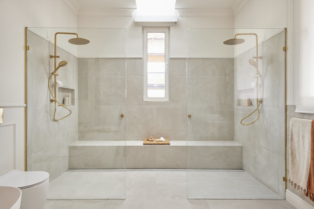
The double shower
What’s better than one shower? Two, of course. Photo: Nine
Why install one shower when you can have two? The double shower featured throughout the team’s en suites with Omar and Oz’s walk-through version popular with the judges and Dylan and Jenny’s especially glamourous one fitted with gold accents.
“It’s a luxurious addition, but it takes up space and adds costs with extra plumbing and fixtures,” Cooper warns.
Make sure you have ample space for them though. Photo: Nine
Install an overhead rain head at one end and a hand-held shower at the other. “If two people are showering together, choose matching heads and mixers,” she suggests. Include a built-in shelf for good looks and convenience, and if budget allows, splurge on a skylight above or a large glass window overlooking the garden.
Rachel and Ryan’s double shower added a “palatial” feel to their en suite, but was deemed too “boxed away” by Blaze.
“Ensure ample space for your double shower – at least two metres by 1.4 metres,” suggests Cooper. “Pick a larger shower head and mount it from the ceiling or wall, ensuring its distance from the floor is around 2.4m.”
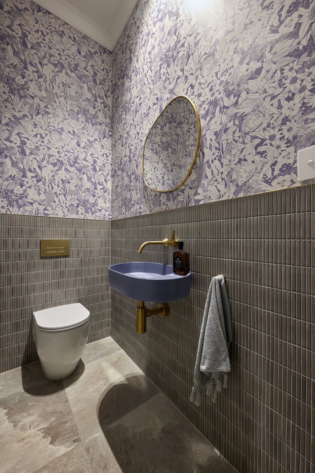
Arty wallpaper
Dylan and Jenny’s subtle pink fern print wallpaper adds colour and flair. Photo: TCC Real Estate
“Beautiful wallpaper creates a link to nature and adds flair,” says Cooper. Dylan and Jenny achieved just that with their subtle pink fern print, as did Ankur and Sharon with their choice based on a drawing by Victorian-era artist John Skinner Prout.
Cooper says an en suite is perfect for wallpapering as its smaller wall space means less wallpaper. “You might only need one roll, so indulge in something designer,” she suggests.
Combine wallpaper with wall panelling, tiles or contrasting coloured paint Photo: Nine
Look for water-resistant vinyl wallpaper or use regular wallpaper beyond splash zones and in well-ventilated spaces. “Technical wallpaper is designed specifically for wet areas and can even be used in showers,” says Hall.
Combine with wall panelling, tiles or contrasting coloured paint. “For a maximalist look, paper all the walls, or just do one wall and feature it like art,” she says.
Decorative windows and doors
Timeless French doors with surrounding architraves, decorative skirting, and classic window frames give even the simplest en suite architectural flair. Photo: Belle Property
Gone are the days of the single sliding frosted glass window. Timeless French doors with surrounding architraves, decorative skirting, and classic window frames give even the simplest en suite architectural flair. “They add a high level of detail and in country homes, ensure consistency with the rest of the house,” says designer Angie Rogers from Interior Tailor Company.
Reeded glass is popular and French doors are an elegant feature, despite occupying valuable floor space, as they did in Omar and Oz’s en suite.
Surround a window in white subway tiles, or place a sash window so it frames a view. “Place above the tub to anchor it in its space and dress with beautiful sheers for next-level luxury,” Rogers adds.
Good bathrooms function, but beautiful ones perform and for the bathroom obsessed and teams on The Block, there is no more important room.
“Bathrooms hover between being a sanctuary and a workhorse,” agrees designer Martine Cooper. “Creating one that looks and feels good and operates well is key. It’s also one of the most profitable rooms to renovate, so it’s an important room to consider.”
While Bathroom Week is always challenging, the teams had the added pressure of creating contemporary bathrooms in classic country homes. The result is five very unique spaces. We asked industry experts for their take on the key trends that have driven them.
Modern Country Style
Omar & Oz’s bathroom is a mix of the country and modern style appropriate for tree-change homes. Photo: Supplied
One of the most challenging aspects of renovating an old home is finding the right balance between classic and contemporary.
Winners Omar and Oz orchestrated a perfectly balanced space that speaks to modern-day living and country style, while Ankur and Sharon’s bathroom, complete with shiny brass fittings and a mix of heritage detailing, was deemed “not respectful to the home’s heritage” by judge Shaynna Blaze.
“There are no hard rules about mixing eras,” says designer Liz Hall from Studio Apercu. “It’s more important to speak to the home’s heritage and retain and restore original elements that speak to its history.”
Rachel and Ryan’s raw timber vanity got the nod, proving you can pair natural elements like wood and stone for a contemporary yet country-style result.
“Combining crisp elements with warm, textural country touches like a warm timber vanity is a perfect way to combine styles,” she says.
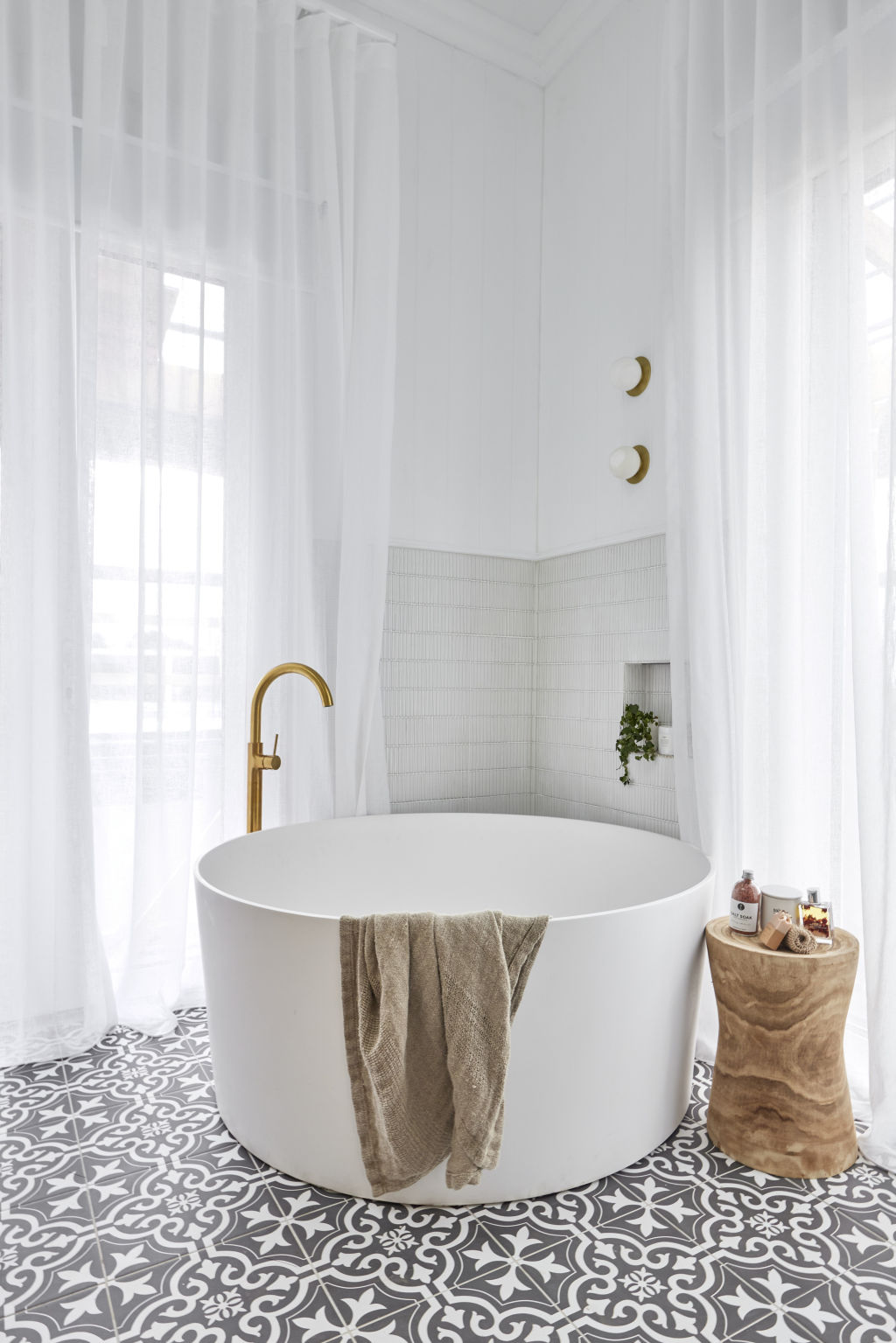
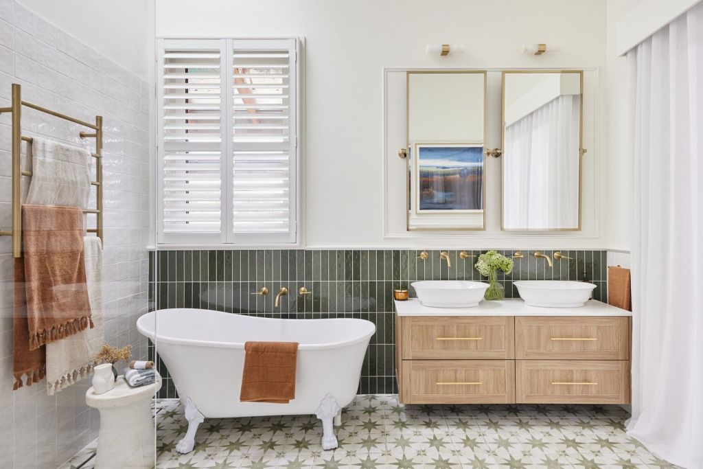
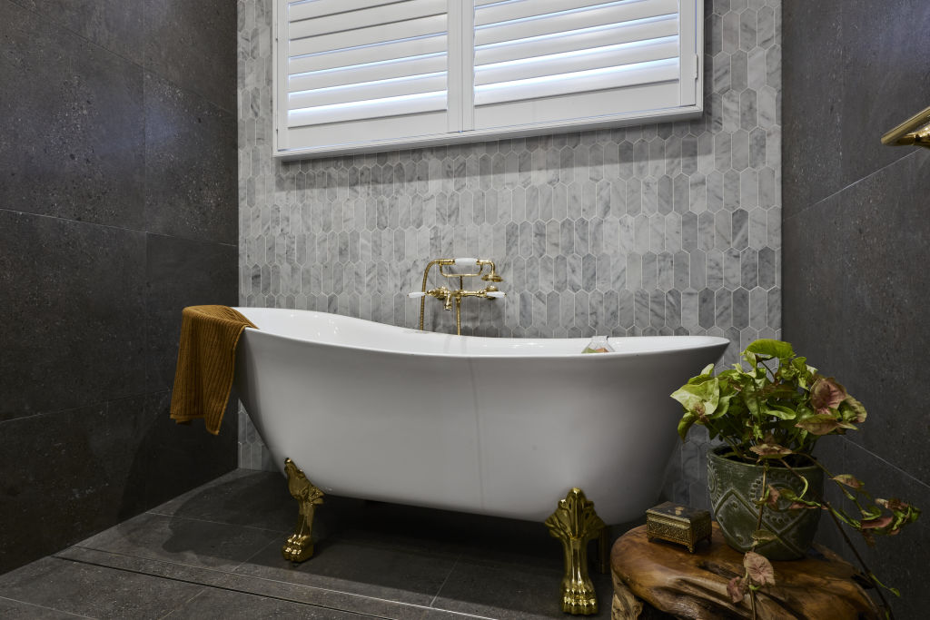
Statement Tub
Sharon and Ankur bathroom Photo: Supplied
Classic clawfoot baths dominated this week, with Omar and Oz declaring the timeless style a “masterpiece”.
“A tub with flare instantly elevates any bathroom,” agrees Cooper. “It’s classic in a period home and works nicely in a contemporary addition. It’s a large impactful fixture, so consider it carefully within the space’s design.”
Along with this classic style, circular and corner baths also imbue elegance. “Choose your tub based on your space’s aesthetic,” suggests Hall. “A clawfoot tub suits a traditional bathroom, an egg-shaped composite stone fits a contemporary space, and a wooden soaking tub looks great in a Japanese-inspired bathroom.”
Luxurious materials like cast iron, copper, marble and porcelain are durable and keep bathwater piping hot. “They’re expensive, so if you’re on a tight budget, consider acrylic or fibreglass options,” she suggests.
Curves
Arched mirrors and door frames are an easy way to incorporate curves into your space. Photo: Supplied
Studies show we are drawn to curvaceous elements evocative of nature.
“They feel cocooning, nurturing and calm,” agrees designer Angie Rogers. “In the bathroom, they add quiet luxury and offset the harder linear materials used in this space.”
Jenny and Dylan were ahead of the curve with their unique take on a classic country bathroom. Their repetitive curved features in the form of arched mirrors and door frames impressed the judges, with Darren Palmer intrigued by the “sense of rhythm” created.
“Add a curved bath or vanity, curvy tapware and lights, or install a curved shower wall, doorway or tiles,” Rogers suggests. “When it comes to curved surfaces, avoid glossy and choose something soft and matt that provides a luxurious finish.”
Tile Mash-Up
Combining wall tiles and heavily patterned floor tiles is a great way to mix and match without overwhelming the space. Photo: Supplied
When it comes to tile combinations – more is more. The couples had fun dialling up the drama this week with unexpected tile mash-ups. “It’s an impactful look,” says Rogers. “It’s also cost-effective for creating an amazing space.”
Large-scale patterned tiles act like artwork, while lighter solid versions take a space from bleak to chic and make small spaces feel capacious. It was a hard lesson learned by Ankur and Sharon, whose moody palette of marble hexagonal tiles and bluestone was slammed by the judges.
“Colour, scale and proportion are critical,” says Rogers. “A larger format tile and smaller style is a good balance alongside a consistent colour range and maximum of two or three tiles.”
“You beauty!” was judge Neale Whitaker’s reaction when this week’s winning bathroom was revealed. The judges agreed Omar and Oz had achieved the impossible – the combination of patterned floor tiles, 90-degree herringbone tiles and VJ walls.
“The linear elements of the VJs are offset by the differing angles of the herringbone, so they don’t compete,” Rogers says. “For those nervous about mixing and matching, try mixing wall tiles and heavily pattered floor tiles; it’s less overwhelming.”
Statement Lighting
Tom and Sarah-Jane’s bathroom chandelier is a show-stopper. Photo: Nine
Next to task lighting, essential for daily rituals, statement lighting plays an important role. From elegant chandeliers and ambience-making dimmers to sophisticated wall sconces, the right light elevates a bathroom like no other design element.
This week, they were popular, with Tom and Sarah-Jane’s a standout. The home’s original classic pendant was scrubbed clean by the couple and restored to its original beauty.
“Beautiful lighting should never be underestimated,” says Rogers. “It conveys sophistication. Take a trip to a luxury hotel; they do bathroom lighting impeccably.”
Sharon’s choice of an art deco light and heritage-style ceiling rose lost points with Shaynna for its eclectic pairing, but Rogers disagrees and says it’s a winning combination. “Don’t be afraid of bringing in a contemporary twist for something unexpected,” she says. “Just ensure it’s crafted from restrained materials, has clean lines and hangs low from the rose, so there is breathing space between the two fixtures.”
Whether oval or rectangular, crafted in timber or witty resin, the coffee table sets the tone for a beautifully functioning living room.
“The right coffee table provides the opportunity to add a layer of texture, colour, and shape to a room,” designer Martine Cooper says. “It’s also practical as a landing spot for coffee, wine, and a place to display some of your favourite things.”
A coffee table should be functional and in perfect scale with other furnishings. Like all important and enduring pieces, it can be a challenging and costly investment.
Your coffee table should compliment your other pieces in the home. Image from Bacic Group and styling by Anna Flanders Photo: Dion Robeson.
“After the kitchen, the living room is the most used room, and if your life revolves there, it deserves a large share of your furniture budget,” designer Elvira Nuic from Bacic Group building and design firm says.
“We sit around the coffee table to relax, lounge and share food with family and friends, and it’s the setting for many a puzzle and board-game night.
“Compared to its larger and more serious sibling, the dining table, it’s clear why the humble coffee table is as deserving of equal importance.”
To splurge or save? Nuic recommends seeking the best-quality coffee table for your budget, focusing on functionality, craftsmanship and classic styling.
“Look for versions in solid timber, glass and stone,” she says. “They’re timeless options that elevate and add texture to your space.”
Size and height are crucial considerations when selecting a style. As the anchor for your space, the coffee table relates to every piece of furniture surrounding it.
With our current love of low-lying lounges, “how low can you go” coffee tables are all the rage. However, team one with a too-high sofa and your wrong-height table can throw the room’s proportions right off-kilter.
“The trick is to use sofa’s seat cushion as a reference point for the table, and try and stay close to, or just below, this height,” Cooper says.
“When it comes to size, ensure its width is in proportion with the sofa, and work on the table being between one-third and two-thirds of the sofa size. Importantly, ensure there is adequate flow around the table to enable movement between it and other furnishings.”
A glass-topped table provides a feeling of spaciousness in a small room, and a larger space can handle a more solid piece, like a heavy design in rustic timber or a closed-volume table.
“It’s a style that offers a real sense of grounding,” Cooper says. “Alongside furniture with straight lines, an oval, round or organic shape provides softness and allows movement without the sharp edges.”
For a flexible room, an ottoman or cluster of smaller tables makes the ideal choice.
“As a whole, each piece complements each other and the room,” Cooper says.
Curves are great for a smaller space. Image from Bacic Group, styling by Anna Flanders Photo: Dion Robeson.
“It’s a popular combination that can be bought as a set or independently. Ensure all leg positions and heights are complimentary so they nest into each other.”
If working within a restricted space, look for a table without rigid lines, opting instead for styles featuring soft, organic curves.
“Allow between 40 and 55 centimetres between the sofa and the coffee table,” Cooper says. “An upholstered ottoman with an oversized tray acting as a stable surface is great, too, for younger children.”
If your vision is larger than your bank balance, get creative with your styling and sourcing.
“Try clustering together smaller, affordable tables, and curate over time with higher-quality ones,” Nuic says. “For elusive designer pieces at lower prices, seek out second-hand markets. If you have the patience and perseverance to pursue quality, it’s where real bargains can be found.”
Once you have selected your table, consider the other elements in the room, arranging them in a way that ensures the space feels balanced and pleasing to the eye.
Make your coffee table pop with thoughtful styling, displaying your favourite fashion tomes, shell collection, chessboard or flowers.
The perfect way to show off your favourite styling pieces in the home. Image from Bacic Group, Klopper & Davis. Styling Anna Flanders. Photo: Dion Robeson.
“For collectors, it’s an opportunity to show off favourite items,” Cooper says. “Group a few items together and use decorative boxes and trays to contain them in one or two areas of the table to ensure there’s negative space.”
Whether you like a concise and considered arrangement or prefer loose and spontaneous, a fail-proof styling formula is to include artistic, organic and reflective items.
“Play with symmetry,” says Nuic, who recommends dividing the surface into halves or thirds, then styling within those areas.
“Use trays to style smaller collections of treasures, and an organic element like foliage or fresh flowers for a sense of calm.”
Most importantly, take a relaxed approach when presenting your coffee table.
“Allow between 40 and 55 centimetres between the sofa and the coffee“Don’t take it too seriously,” Nuic says. “It’s nice to have a place to just put your feet up once in a while.”
My passion for interiors has been there from a young age and while I pursued other career options to begin with – I always found myself looking for a creative angle in all my work. The combination of the creative and having an extensive background in business and project management has been the perfect combination for me to develop logical strategies for problem solving and navigating the design and build process.
HERITAGE MASTERCLASS: featured in Home Beautiful Magazine
Tips on bringing your heritage home into the 21st century – a contemporary renovation.